Medium Vintage: A Bold Blackletter Font for Digital Impact
It started with a hero section. I was redesigning a boutique coaching website—clean layout, warm photography, intentional whitespace—and the headline just felt… safe. Too safe. I swapped in Medium Vintage, typed “Clarity Begins Here,” and instantly, the page exhaled with character. Not chaos—intention. That’s when I knew this wasn’t just another decorative font. It’s a digital tone-setter.
What Medium Vintage Brings to the Screen
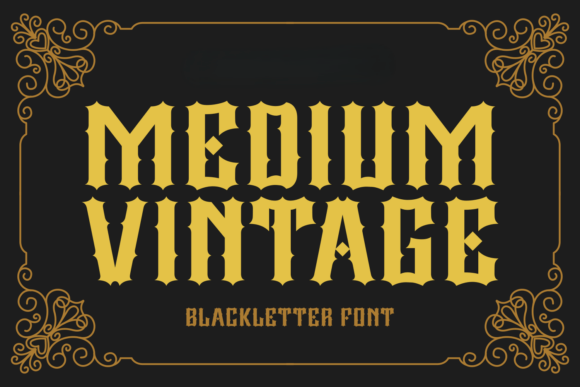
Medium Vintage is a confident blackletter typeface—bold, structured, and deeply nostalgic without leaning into caricature. Its tall x-height, sharp terminals, and subtle ornamental curves recall vintage signage and early 20th-century poster lettering, but rendered with crisp vector precision. On screen, it holds weight without blur, scales cleanly across breakpoints, and carries presence even at modest sizes—especially in headings, banners, and branded accents. It doesn’t whisper; it anchors.
Real Layout Testing: Where It Shines (and Where It Doesn’t)
I tested Medium Vintage across multiple real web contexts: a portfolio homepage banner, a product landing page CTA, an online course sales header, and a blog post title over a textured background image. In every case, it elevated visual hierarchy—drawing the eye first, reinforcing brand voice, and adding editorial gravitas to otherwise minimal layouts.
Here’s what worked beautifully:
- Hero headlines — At 48–64px on desktop and 32–40px on mobile, it remained legible and impactful, especially against light or mid-tone backgrounds.
- Section dividers and feature titles — Used at 28–36px in a SaaS dashboard sidebar, it added distinction without overwhelming interface clarity.
- Branded call-to-action buttons — Paired with generous padding and ample contrast, its boldness translated directly into perceived confidence and trust.
- Logo lockups and favicon text variants — The clean outlines and consistent stroke weight made it surprisingly adaptable for small-scale branding assets.
But let’s be practical: Medium Vintage isn’t built for body copy, navigation menus, form labels, or dense data tables. Its decorative rhythm slows reading speed, and its tight spacing can cause crowding below 18px—especially on lower-DPI screens. I tested it at 16px in paragraph form and immediately reverted. It’s a display font, not a workhorse—and that’s exactly its strength.
Pairing for Clarity and Contrast
The magic of Medium Vintage multiplies when paired thoughtfully. I consistently paired it with Inter (a highly legible, open-source sans serif) for all body text, captions, and UI labels. The contrast between its ornate structure and Inter’s neutral warmth created instant visual rhythm—authoritative yet approachable.
For more editorial or luxury-leaning sites, I also explored pairing with Playfair Display (a refined serif) for subheads—adding typographic dimension without competing. What didn’t work? Another decorative font, or anything overly condensed or script-based. Medium Vintage commands attention—it needs breathing room and functional support.
Responsive Behavior & Technical Notes
Loaded via @font-face using WOFF2 (the included web-optimized format), Medium Vintage rendered crisply across Chrome, Safari, and Firefox—even on iOS Safari with forced scaling disabled. No hinting issues. No unexpected kerning collapses on resize. I tested it over high-contrast image overlays using CSS text-shadow (1px black, 75% opacity) for added readability, and it held up flawlessly.
A few technical checks before deploying:
- Licensing — Verified commercial web license covers client projects, SaaS dashboards, and e-commerce storefronts (not just personal use).
- File formats — Confirmed WOFF2 + WOFF delivery for broad browser support and fast load times.
- Character set — Checked Latin-1 support (covers English, Spanish, French, German); confirmed no extended diacritics or Cyrillic—so plan accordingly for multilingual sites.
- Weights & styles — This version includes one strong weight (Medium) with standard uppercase/lowercase, numerals, and punctuation—no italics or bold variants, so avoid relying on
font-weight: boldoverrides.
Digital Branding Beyond the Homepage
Where Medium Vintage surprised me most was in consistency-building across touchpoints. I used it for the main headline on a campaign landing page, then echoed it subtly in social media ad banners, email subject lines (rendered as web-safe fallbacks where needed), and even in SVG illustrations exported from Figma. Because its shape language is so distinct—those sharp points, vertical emphasis, and controlled curves—it became a quiet signature. Customers didn’t quote the font name—but they recognized the tone across platforms.
It also performed well in dark mode. With slightly increased letter-spacing (letter-spacing: .03em) and adjusted contrast ratios (tested with axe DevTools), it retained legibility and mood without feeling harsh or dated.
For creators building digital brand kits, course templates, or downloadable design assets: Medium Vintage adds immediate premium perception. Just remember—its power lies in restraint. One strong headline. One memorable section title. One deliberate accent. Let it lead, then step back and let your content breathe.